Mood Board Mondays: Wind’s Breath Cottage Living Room
Create a warm, collected cottage living room using Benjamin Moore Wind’s Breath, classic blue accents, and timeless layered furnishings.
Latest from OSH
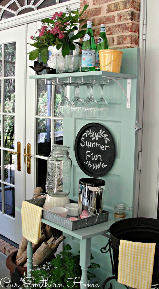
- Saturdays on the Porch #86
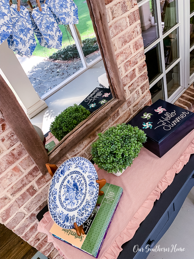
- Saturdays on the Porch #85
- Easy European Wall Art with Thrift Store Frames
- Piano Bench Makeover with New Color and Fabric
- Style a Classic Coffee Table with Thrifted Items
This post may contain affiliate links. If you purchase something using one of my links, I may earn a small commission from the retailer costing you nothing more. You can read more on my disclosure page. Christy Little of Our Southern Home is a participant in the Amazon Services LLC Associates Program, an affiliate advertising program designed to provide a means for sites to earn advertising fees by advertising and linking to amazon.com.
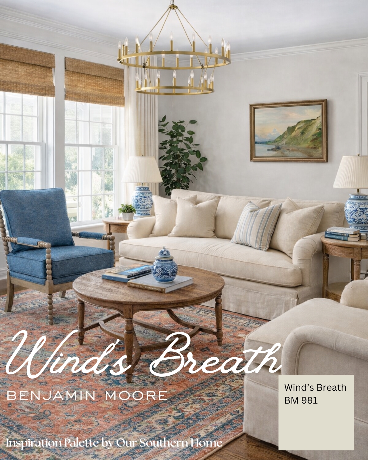
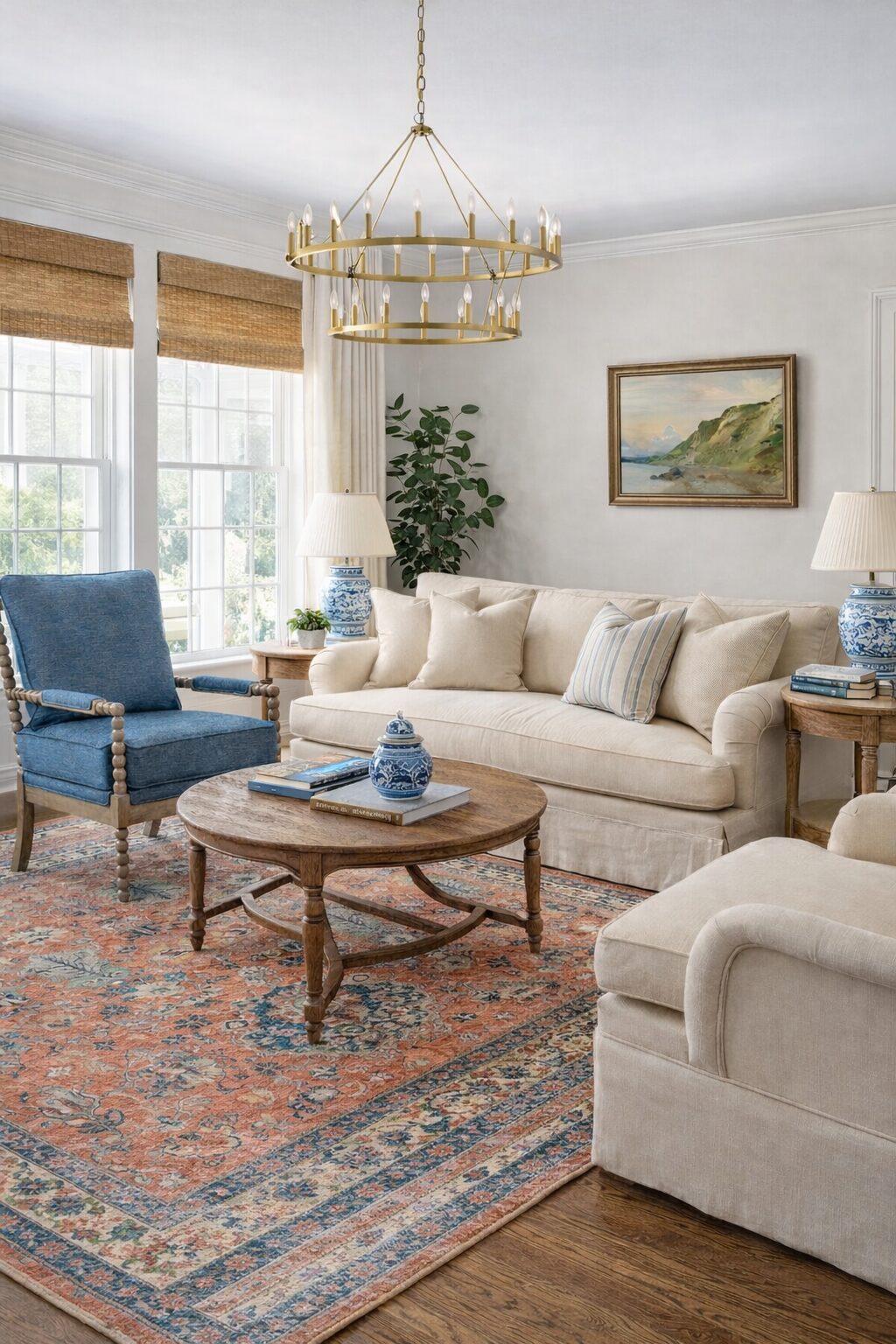
There’s something comforting about a living room that feels calm and lived-in, where nothing is too precious and everything has a purpose. The kind of space that welcomes you in at the end of the day, invites conversation, and quietly evolves over time. That feeling—easy, layered, and timeless—is what inspired this week’s Mood Board Mondays.
For this living room, I started with the paint color and built outward, letting soft neutrals, classic blues, and warm textures shape the rest of the space.
I created the prompt to design this moody bedroom with the help of AI.
The Story Behind the Room
I imagine this room as the heart of the home. Morning light filtering in through the windows, coffee cups left on the table, a favorite book resting on the sofa arm. It’s a space meant for everyday life—family gatherings, quiet afternoons, and evenings that stretch a little longer than planned.
The furnishings feel collected rather than matched. A comfortable sofa anchors the room, softened with tailored pillows. A well-worn rug adds warmth underfoot, grounding the space and hinting at history. Lamps glow softly as daylight fades, and the room settles into its most inviting version of itself.
Nothing here is flashy or fleeting. Instead, this living room is designed to feel familiar, welcoming, and quietly beautiful—now and years from now.
I see this look as the base, the starting point. To create a true cottage look, you will add all your collected treasures and found, thrifted items. The art above the sofa can be a starting point for a collected gallery wall.
Why These Colors Work So Beautifully Together
At the center of this palette is Wind’s Breath (981) by Benjamin Moore, a warm, creamy neutral that brings softness without feeling flat. It adapts beautifully to changing light, making it an ideal choice for living rooms and family spaces where you want an easy, relaxed backdrop.

To add depth and contrast, I layered in Andes Summit (CSP-600), a rich blue that grounds the space and adds a classic note, and Herbes de Provence (OC-634), a muted green that brings an organic, calming balance. Together, these colors create a palette that feels timeless and versatile—perfect for a collected cottage-style living room.


Benjamin Moore Wind’s Breath (981) is a warm, creamy neutral that brings an effortless softness to a space without feeling flat or washed out. It has just enough depth to feel cozy, yet it reflects light beautifully, making it especially well-suited for living rooms and family spaces. This is the kind of color that adapts throughout the day—warm in the morning, calm and grounded by evening—creating a backdrop that feels timeless, welcoming, and easy to live with.
Benjamin Moore Andes Summit (CSP-600)is a rich, classic blue that adds depth and contrast without overwhelming the room. It pairs beautifully with soft neutrals like Wind’s Breath, grounding the palette while still feeling refined and traditional. Used in accents, furnishings, or adjoining spaces, this blue brings a sense of calm confidence and gives the room that collected, layered look that feels intentional rather than trendy.
Benjamin Moore Herbes de Provence (OC-634) is a muted green with a gentle, organic quality that softens the overall palette. It introduces a natural element that balances the blues and neutrals, adding warmth and subtle character without drawing too much attention. This color works beautifully in supporting roles—through accents, nearby rooms, or even decor—bringing an understated, calming presence that helps the space feel complete.
I always recommend purchasing small sample pots of color before investing in large quantities. You can also use a site called Samplize to get large-sized swatches.
A note about the paint colors selected: the main color is the wall color. The supporting colors do not necessarily need to be painted. You could use these to paint furniture, but you can also use these colors as you search for decor, art, and fabrics.
Shop the Look
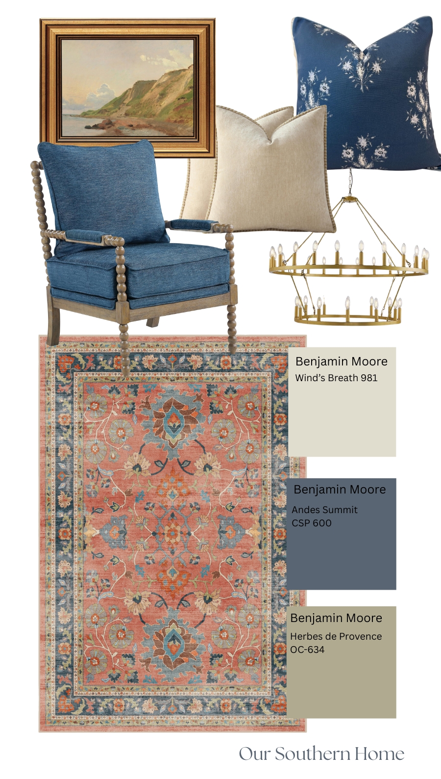
To recreate this living room, I focused on pieces that feel classic, comfortable, and easy to live with:
- Vintage-inspired area rug – A warm foundation that brings in coral and blue tones while grounding the entire room. This rug features Ruggable.
- Neutral upholstered sofa – A timeless anchor that keeps the space light and relaxed
- Accent chair – Comfortable seating that adds character without overwhelming the layout
- Round wood coffee table – Softens the room with gentle curves and encourages conversation
- Blue-and-white table lamps with pleated shades – A classic touch that adds depth and a collected feel
- Tailored pillows in soft blues and neutrals – Blue pillow and Neutral pillow
- Layered accessories and greenery – Simple details that bring warmth and life to the space
- Gold Chandelier– Whether single or a double wagon wheel chandelier, it adds sophistication to your space.
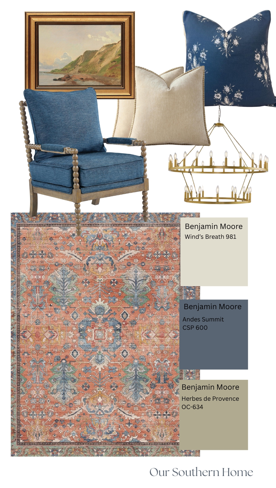
This is the same design board with a different, more budget-friendly rug option.
This space is a digitally created inspiration image. Linked items are similar pieces to help you recreate the look.
Cottage Living Room
More Affordable Ideas
Visit my Amazon posting of this shot to see more affordable items from Amazon.
Mood Board Mondays
Mood Board Mondays is a weekly series where I share color-driven inspiration designed to feel timeless, welcoming, and collected. Each mood board begins with paint and builds outward—layer by layer—to create spaces that feel lived-in and loved.
If you enjoy this style of decorating, you may also like:
- Mood Board Mondays: A Moody Guest Room in Silhouette
- (Future Mood Board Mondays posts will be linked here as the series grows)
I hope this living room inspires you to slow down, trust your instincts, and create a home that feels just right for the way you live.
If you love rich, cozy spaces with timeless style, you’re in the right place.
Do you have a color or rug that you want me to help visualize for my readers? Shoot me an email with the rug link! You can email me: [email protected]